Houston has been Ampol’s strategic brand partner since 2015, leading the transformation of the business’ brand portfolio, as well as its internal culture and purpose programs.
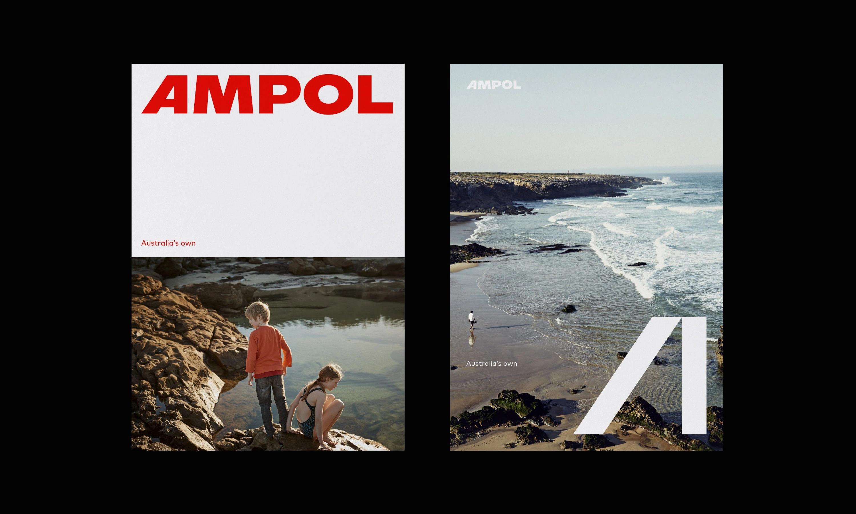
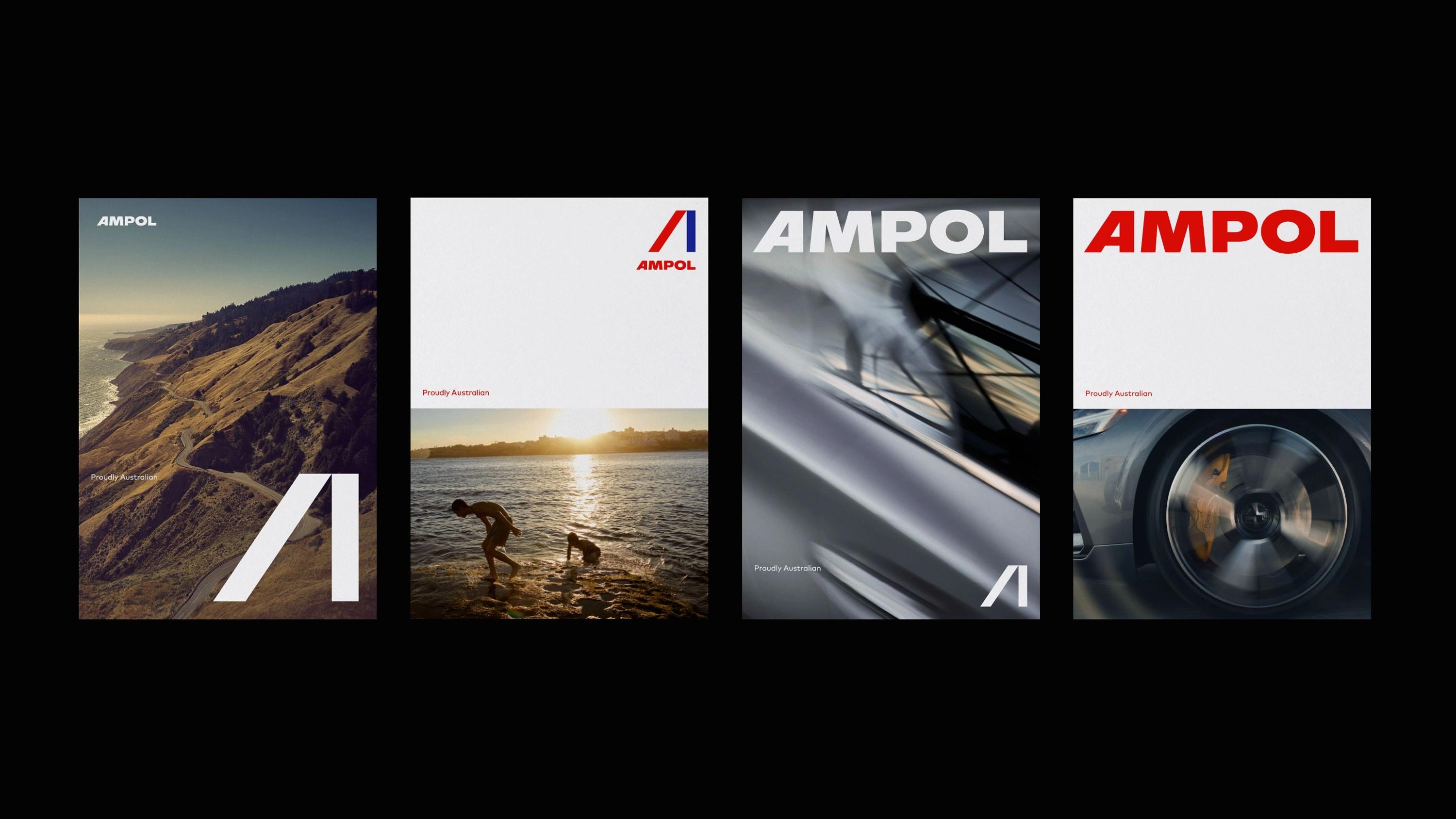
In 2018, a change in circumstances meant it was time to explore options for an alternative fuel brand. Since Ampol are an Australian owned and operated company, it was essential that the new brand reflected not only the character of Australia, but the future-focussed mindset of a renewed premium fuel provider. We explored a number of hypotheses and scenarios for change – and through rigorous consumer testing confirmed a revitalised Ampol was the right approach. It was time to bring back an Australian icon
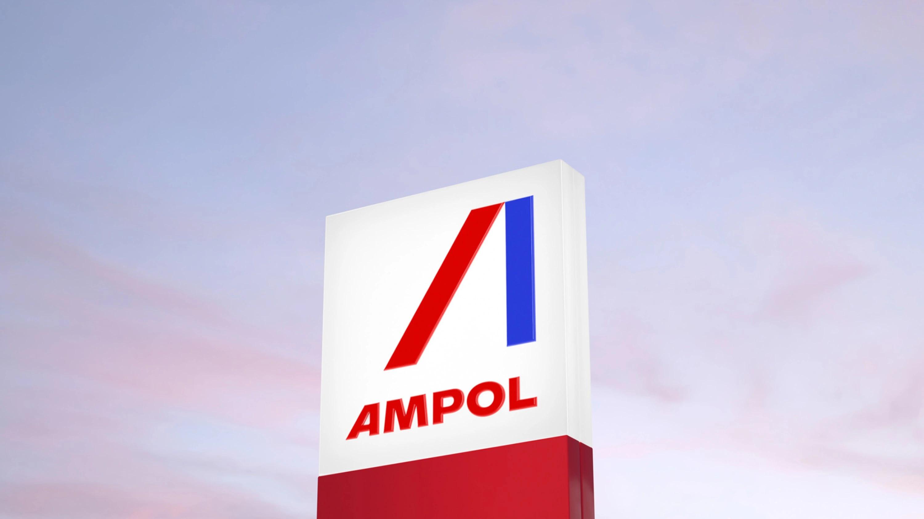
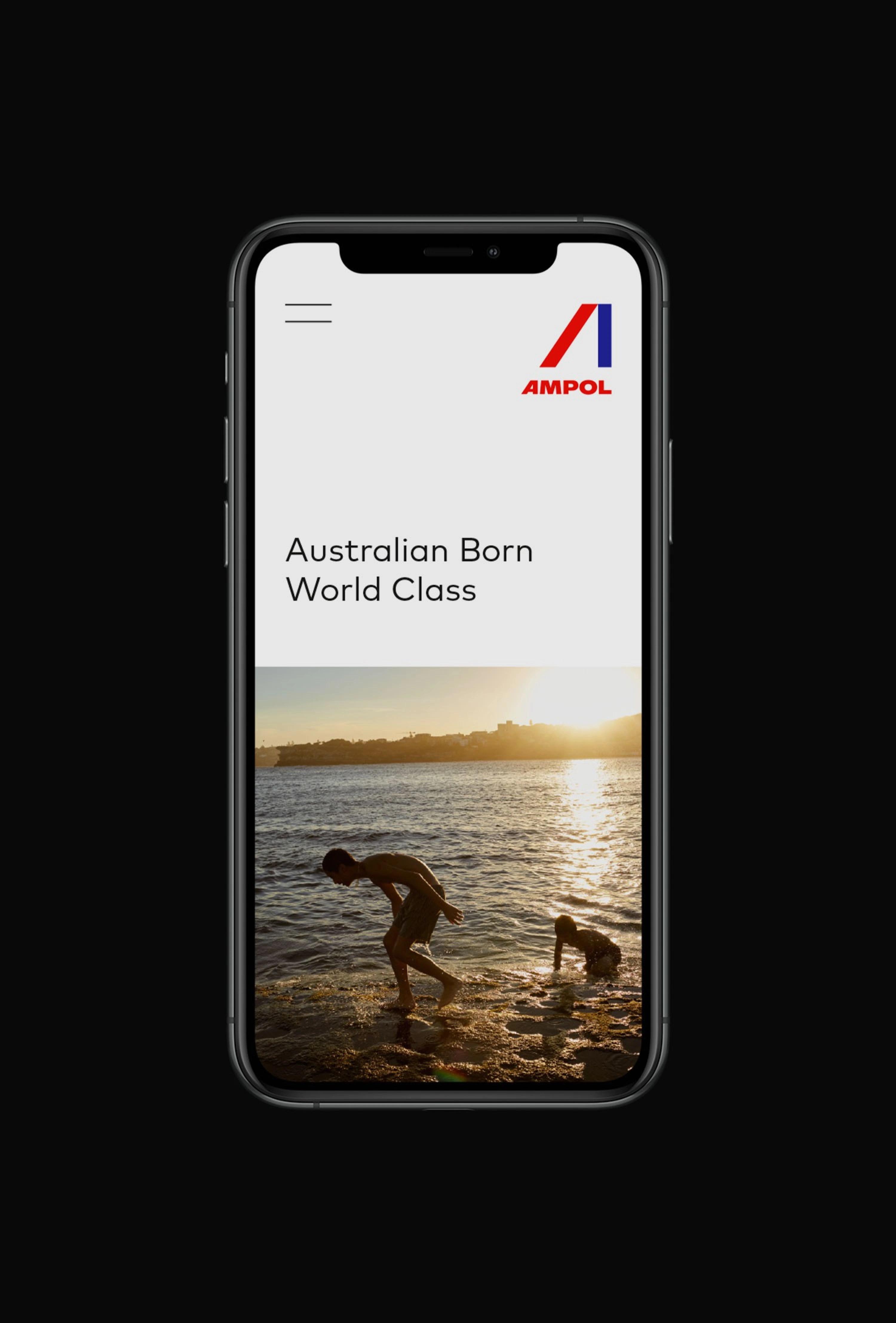
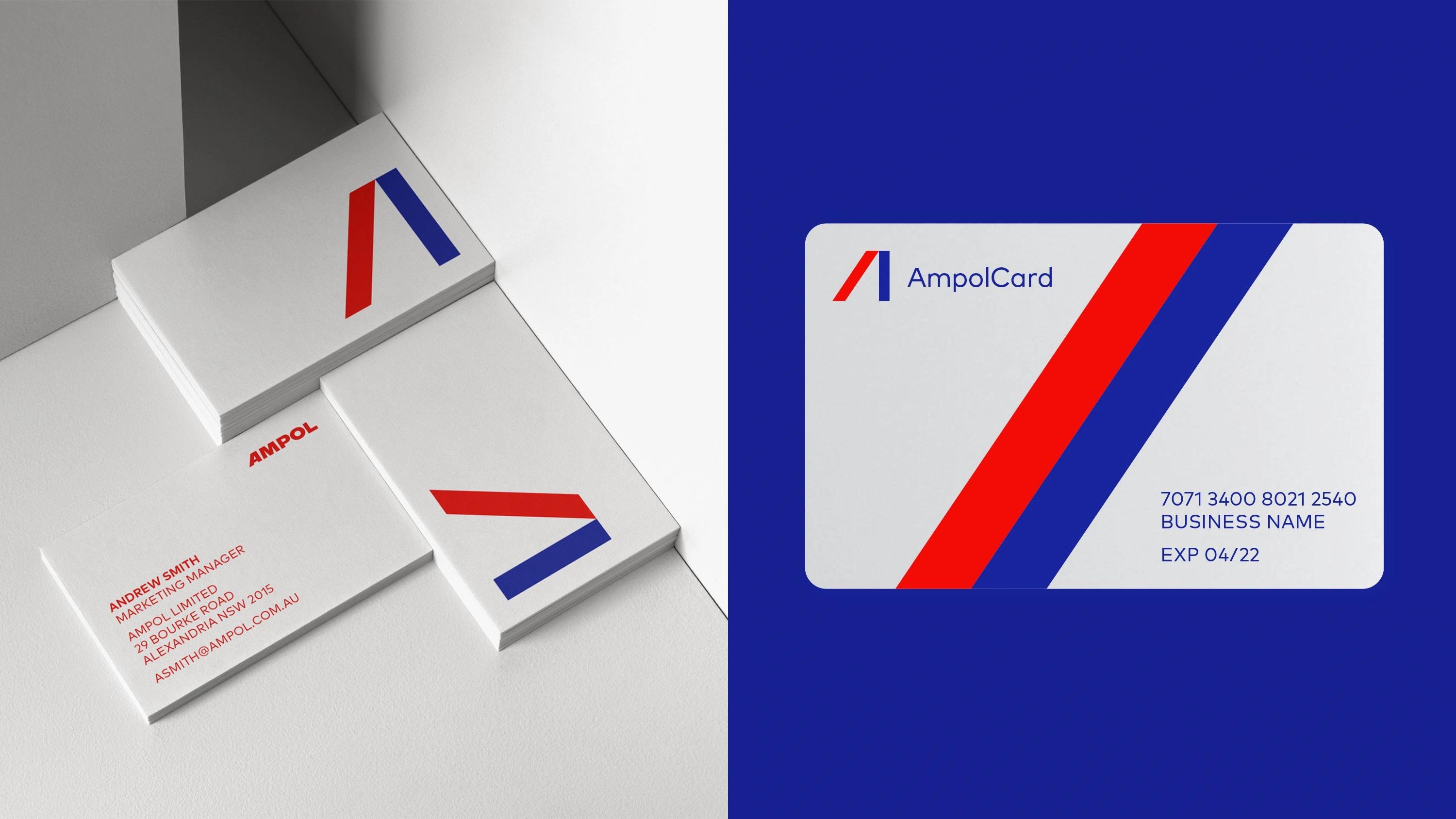
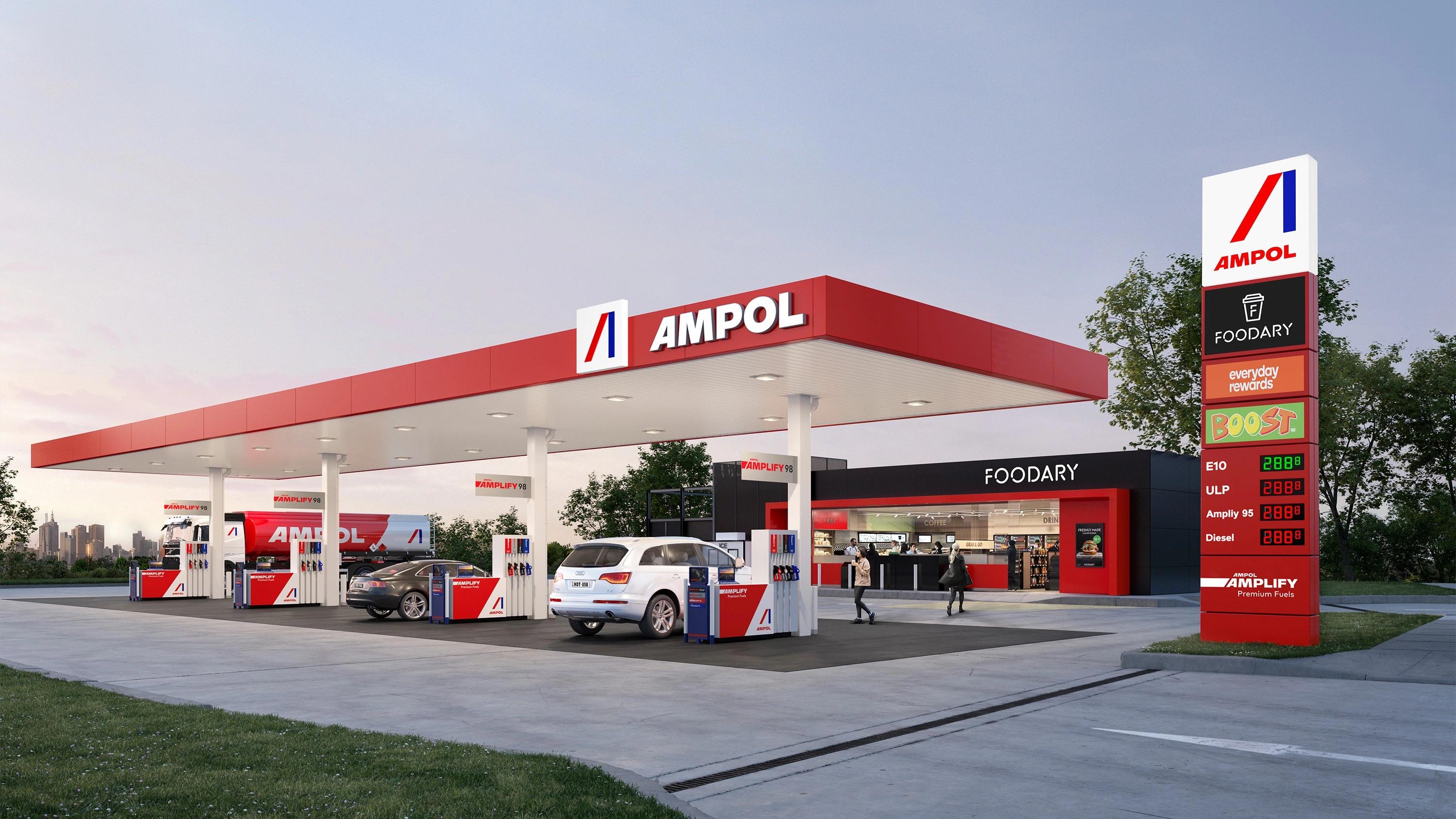
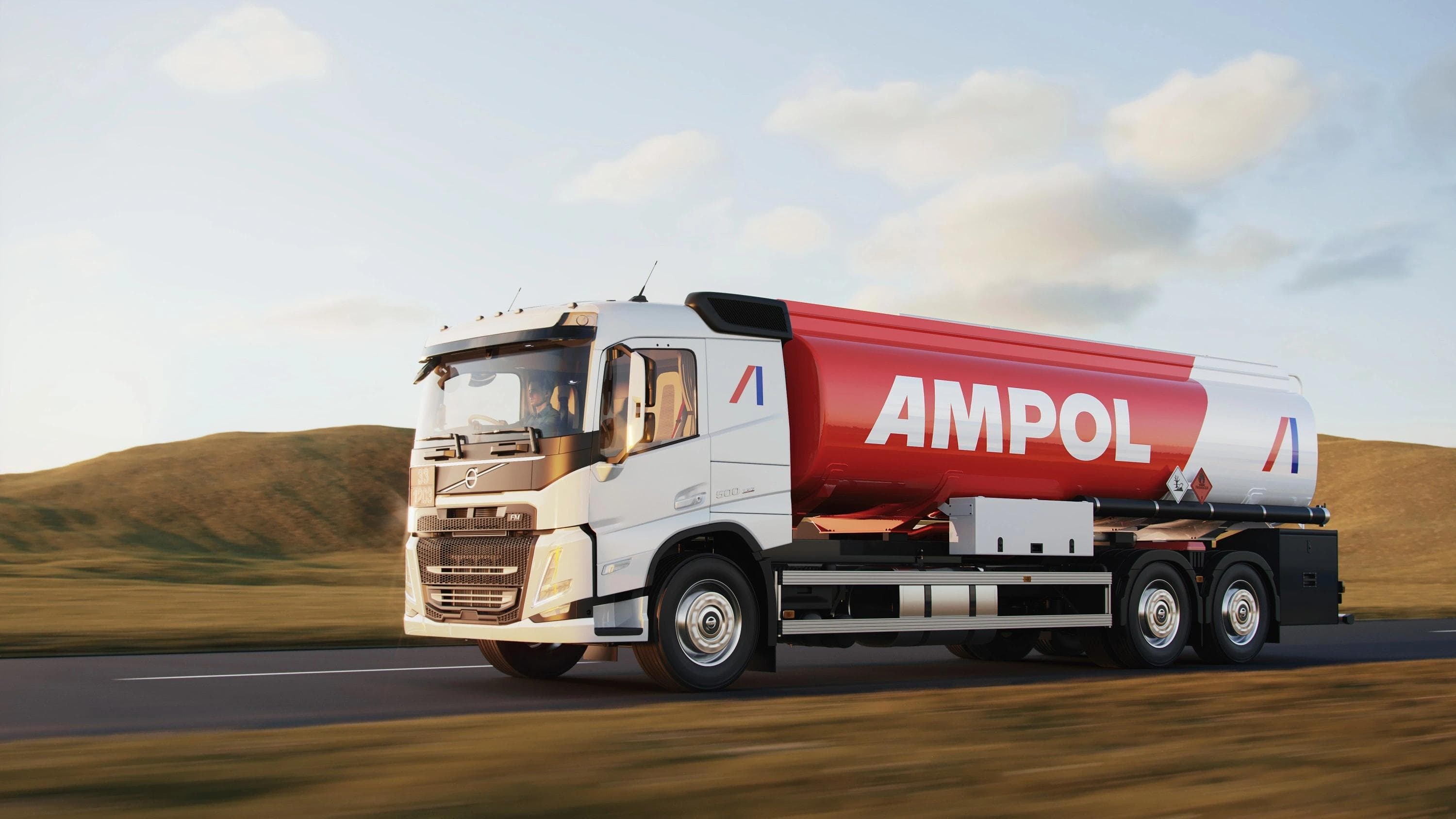
The Ampol name evokes fond memories for many Australians – and the fresh, modern brandmark connects it with a new generation of customers.
Ampol’s logo captures both a nod to the heritage and a look to the future. The original red and blue bands and capitalisation of the word, Ampol, link to the heritage logo, while the new, modern and distinctive leaning ‘A’ symbolises forward momentum.
The new logo features bold custom typography, priming Ampol to become once again Australia’s most loved and admired premium fuel brand—a simple, striking beacon for customers when on the road.